Article Summary (TL;DR)
✅ This article defines Amazon A+ Content as a way for sellers to enhance their product listings with richer descriptions, high-quality images, and multimedia content.
✅ The guide showcases the advantages of using Amazon A+ Content, including increased conversion rates, boosted sales, and a platform to highlight your brand story.
✅ The resource provides detailed instructions on how to create compelling Amazon A+ Content, emphasizing the importance of visual appeal and leveraging multimedia elements.
According to Amazon, A+ content is:
The A+ content feature enables brands to change the product descriptions of branded ASINs.
You can use this tool to describe your product features in a different way by including a unique brand story, enhanced images, and text placements.
Amazon Seller Central Help
Amazon A+ Content (formerly known as Enhanced Brand Content) goes beyond the basic bullet points and product descriptions. It’s fair to describe it as a WYSIWYG page builder.
It’s working on an enhanced Amazon EBC template.
In a manner that isn’t feasible with standard product listings, enhanced brand content enables you to include a personalized part in your product description space.
It’s similar to giving your outdated, generic product description a makeover.
You can add and rearrange modules, including text, graphics, sidebars, and more, under the EBC section. These modules are available in a number of pre-made themes, or you can create your own.
Note: If you’re interested, we also have a guide on how to sell to Amazon directly.
It lets you explain how your product can solve your customers’ pain points. It also lets you tell your brand story. This is the power of Amazon enhanced brand content templates.
The whole idea behind using the Amazon A+ content is to improve buyers’ experience and push them to make informed buying decisions.
A+ content consists of stunning product images shot in different angles and close-ups, high-definition videos of your products, informative and precise introduction to the product or item, and clear bullet points list highlighting the product feature.
Other things found in good A+ content are comparison charts and other related product details.
There are many brands with beautifully done A+ content. It will increase your conversion rate, sales, and reduce ACoS using Amazon A+ content.
You can also leverage the A+ content to increase customer trust and rank higher in Amazon search results because of the increased conversions.

Who Can Use A+ Content?
Brand owners can use Amazon A+ content.
- You need to be a professional seller and registered as brand owner of an ASIN
- You can be an emerging brand owner approved for a managed selling program such as:
- Launchpad, or
- Amazon exclusives
Contact brand registry if you are a registered brand but you still don’t have access to A+ content or Amazon enhanced brand content template.
What are the Most Ideal Amazon A Plus Content
There are only two types.
- Basic A+ content, and
- Premium A+ content (with enhanced brand content templates)
You have access to various modules and layouts in Basic A+ content. You have access to a rich text editor that can format bullet points or number lists.
You can use images and texts in various different enticing layouts.
Aside from that, you can use comparison charts as well as custom headers and images.
- Image size – 970×300
- 5 allowable modules
- 14 module selection
Meanwhile, Premium A+ content (with Amazon A+ content templates) has various modules and layouts that are designed to increase engagement. It’s made to take up more space and be used for a richer media experience.
- Image size – 1464 x 600
- 7 allowable media modules
- 19 module selections
- Navigation carousel
- Q&A module
- Video modules
What is the Cost for Premium A+?
According to Seller Central, Premium A+ content is free for this promotional period. However, once that period is over, you will have to pay a fee.
But don’t worry. You can opt-in to pay the fee and will not be charged without your consent.
I’m not sure about hiring Amazon A+ page designers but you can definitely do this on your own.
What happens at the end of the promotional period?
After the promotional period has ended, Amazon reserves the right to remove your access to add Premium A+ modules to new ASINs.
Any Premium A+ content published to ASINs will be available for free on the detail page after the promo ends.
What are the eligibility criteria for Premium A+?
These are the eligibility criteria.
For brand registered sellers, all of the ASINs in your catalog that you own have already received the A+ Brand Story and are published.
Or within the last 12 months, you have at least 15 project entries with A+ content approved.
How will I know if I’m eligible for Premium A+?
Amazon will always re-evaluate eligibility for Premium A+ for all brand registered Amazon sellers. No need to contact Amazon.
You will notice a banner in the A+ content manager advising you of access and a link to generate Premium A+ content if you are eligible, and Amazon will enable this function for you within the A+ content manager.
What is a Brand Story?
Compared to standard A+ content, a brand story is more expansive and immersive, since brands use it to match their mission statement and brand story with the values of their target audience.
How to Create A+ Content?
Go to Seller Central → hover your mouse on Advertising

Select A+ Content Manager

Start creating A+ content OR search for existing ASIN to edit

Amazon A+ Content Best Practices
1. Be different from your competitors
Emphasize your brand’s unique selling proposition (USP). Start by asking yourself, “how can my product or inventory solve customers’ pain points?” “What are the major benefits customers will derive from my product?” “How can my products help prospective customers in their daily activities?”
Remember that a product feature and product benefit are two different things.
While product features are important for prospective customers to know beforehand, emphasizing the products’ benefits will help evoke emotions. And emotions drive purchases.
2. Keep the content short and straight to the point
Don’t make the shopper struggle when reading your A+ content page. Keep your content short and precise, highlighting only the important product features.
Shoppers can quickly glance through your page and make an informed buying decision.
3. Use stunning product images
Don’t use pixelated, heavily photoshopped images. Use quality images. A no-brainer.
4. Use product reviews to fine-tune product listings
Product reviews, especially those written by verified purchasers carry a lot of weight in terms of sales, traffic, and conversion rate, so don’t underestimate them.
Read your customers’ reviews and even those posted on your competitors’ pages to get a feel of what your audience wants to know.
5. Use the right image size and resolution
Make sure the image you intend to use has the right size and resolution to display properly on different screens. You don’t want squashed images that don’t look good on mobile and tablets. Check the image sizes above.
6. Use banners
Professional sellers use banners to split their product detail pages. Banners can display your product or inventory to buyers as a new segment, attracting them with HD images and also educating buyers in the process.
7. Keep the designs uniform throughout the content
Keep your designs uniform. Your design is not only for one listing page. It should be applied to all your products to give a consistent branded look.
What to Avoid with Amazon A+ content
Amazon takes a day or two to review your submission before it goes live on the listing.
Your submission will be rejected or delayed if you fail to stick to these guidelines:
- Do not include any language like best-selling or guaranteed products.
- Special characters, trademarks, and copyright symbols are not allowed.
- Proofread the content at least twice to ensure there are no spelling errors.
- Don’t mention other brands or your competitors.
- Make your content simple, clear, and appealing.
- Do not include any links related to your website.
- Image resolution should be clear.
Based on our experience with Amazon A+ content, one very important thing to check are Amazon restricted words. If the AI catches them, it will prevent you from submitting your content.
For example, using words like organic, mold, or bacteria might prevent you from submitting your content, and even if published, your listing will likely be taken down at a later time.
Looking for more Amazon seller tools, spreadsheets, and checklists?
Join our mailing list to download our free spreadsheets, checklists, and other tools
38 Premium A+ Content Examples from Amazon
1. Casper

What they do well
- Super clean design.
- Sells you the benefits first and not the features. Makes you want to relax on the mattress.
- Lots of white space and uncluttered.
What can be improved
- Casper focuses on their brand and company benefits without much on the product.
- Want to see how it is better than the competition.
2. One Plus 10

What they do well
- A+ premium content with video placement that most sellers don’t have or do.
- Advanced features where you can click to load sections of the image.
- High quality images.
What can be improved
- Feels too bland like it’s the same for other phones.
- Inject some personality or accent colors.
3. Vagisil

What they do well
- Bold color scheme that matches their brand.
- Benefits related copy. One of the best Amazon EBC examples.
What can be improved
- Better lifestyle images.
- Photo of the product could be improved with better lighting.
4. Apple AirPods

What they do well
- Everyone knows what it is so they don’t bother wasting words.
- Hi def image of the product to see every pixel.
- Black and white contrast give visual impact.
- Serves as one of the best A+ content examples.
What can be improved
- If this was any other brand, it wouldn’t have worked as well.
- Could show comparisons and why Airpods are better.
5. Cattleman’s Cut Beef Jerky

What they do well
- Mouthwatering images.
- The photos tell the story of the feel of the company and history.
What can be improved
- Features highlighted in the main banner.
- The title doesn’t mean much.
- Could show images of how it’s made to fully deliver the entire story of quality.
6. Vitafusion Multivitamin

What they do well
- Bright and bold color scheme done well.
- 3D generated images. No photos.
- Highlights all the information that is important.
- Lots of trust factors
What can be improved
- Picture of a woman, for women targeted product, would make it easier to scan and understand.
- Real photo of a close up of a gummi to make it mouthwatering.
7. Peet’s Coffee

What they do well
- Photo colors all match and provide consistent branded feel.
- Can see the quality work in progress. Allows the shopper to be part of the story.
What can be improved
- Could do better by using big banner style images rather than grid format which is small and crams a lot of information.
- How many people will read it?
8. L’Oreal Paris Elvive

What they do well
- Beautiful people. Shiny hair.
- Gold and black look stunning.
- 3D images of products, not photos make it look more alive.
What can be improved
- Not much.
9. Ridge Wallet
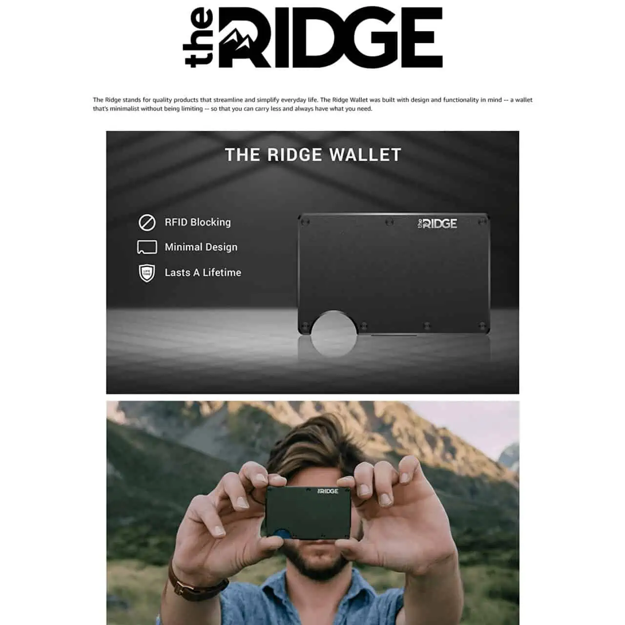
What they do well
- The first main image is excellent showing the product.
- 3 benefits are very clear and easy to understand.
What can be improved
- The logo is overly big and the text underneath it is barely legible.
- 2nd image has no relevance to the product, or purchase or the benefits mentioned. Disconnect in the message.
10. CamelBak Eddy Kids
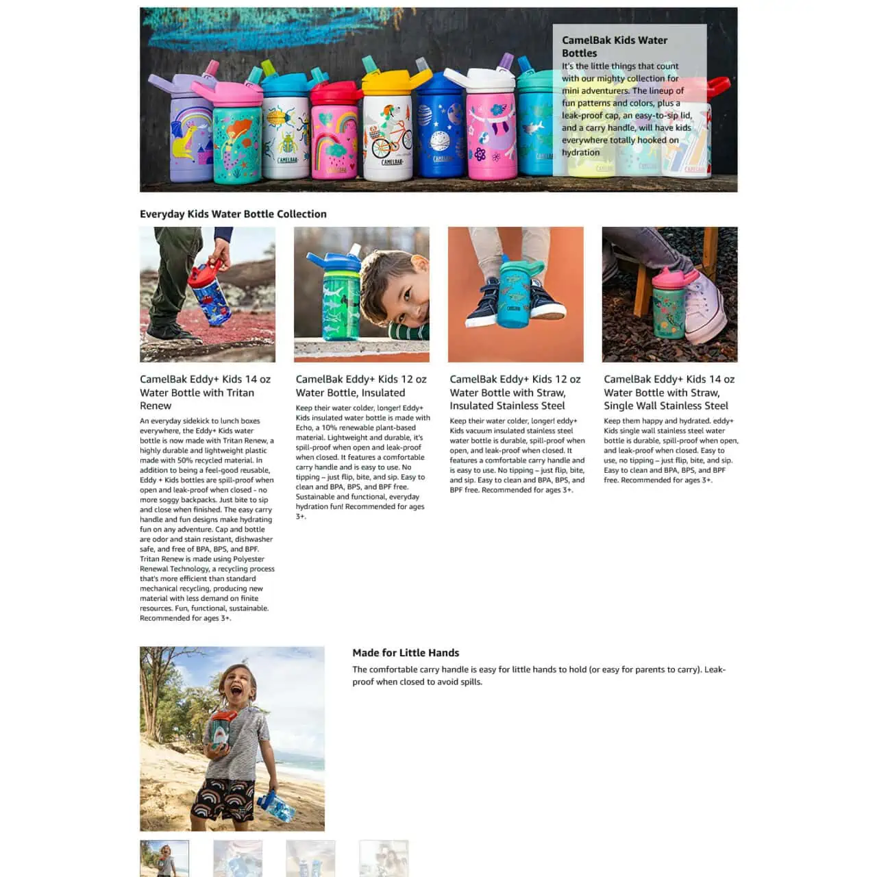
What they do well
- Shows the various designs they offer.
- Very clear that it is for kids.
- Lots of lifestyle photos.
What can be improved
- Convert the text into images.
- The first grid text is a wall of text.
- Increase the size of images and make it more attention grabbing.
11. Micro Machines
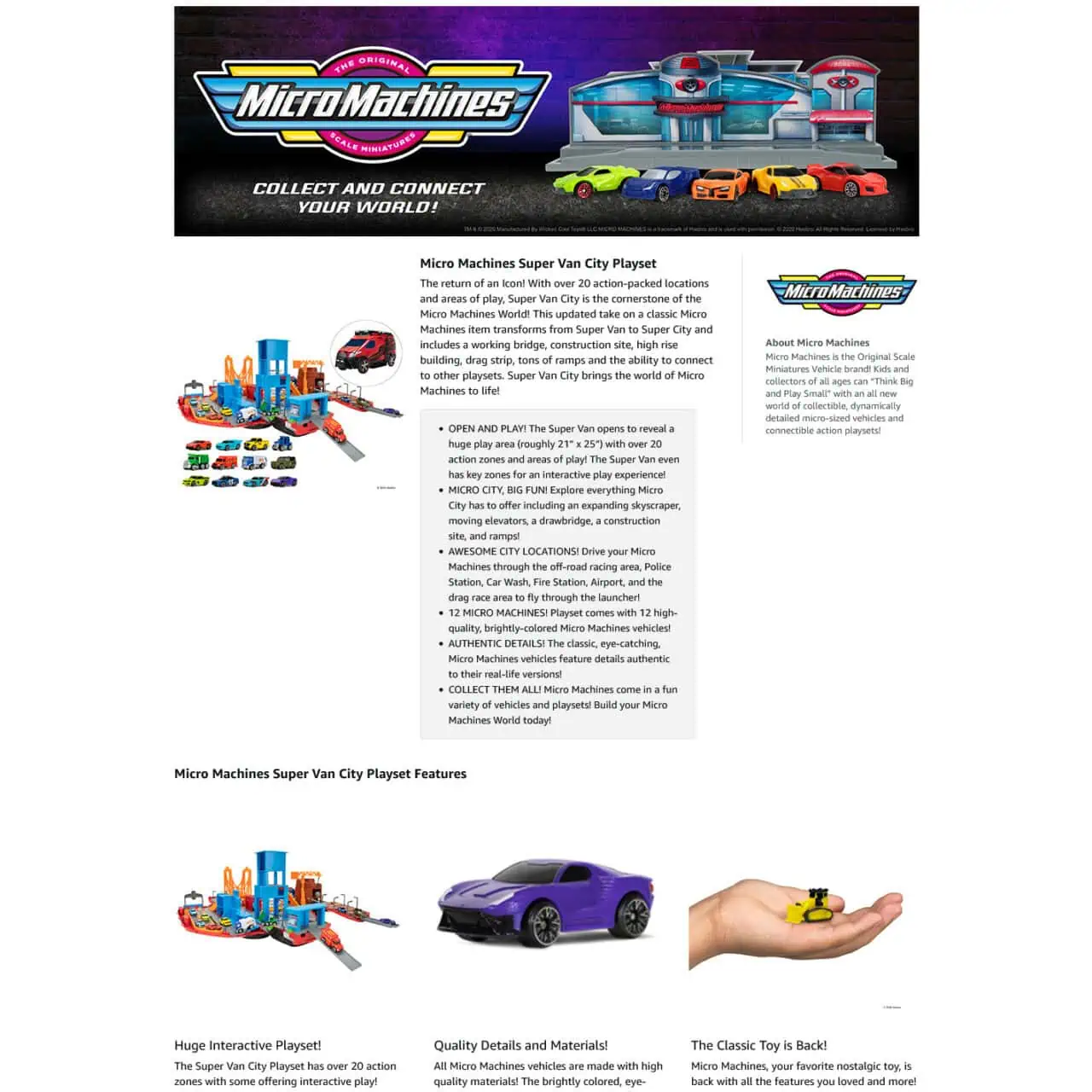
What they do well
- The header banner is excellent.
- Closeups of photos are great.
What can be improved
- Started off well, but became boring quickly.
- Too much text that people don’t read.
- The toy images look similar.
- Should have used their bright colors to keep telling the story and part of the action.
12. Bissell SpotClean
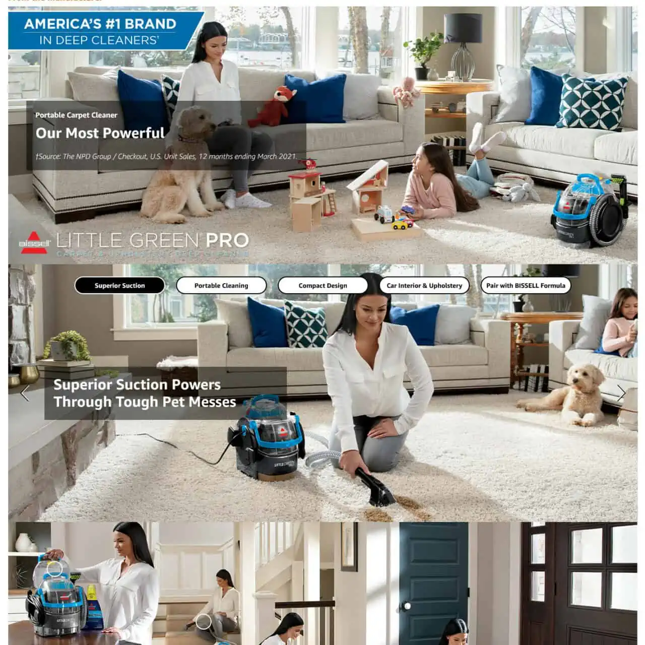
What they do well
- Very engaging EBC or A+ content.
- Consistent photos, scenes, layout, people.
- Big and easy to see products and benefits.
What can be improved
- They state a source that people don’t care about “†Source: The NPD Group / Checkout, U.S. Unit Sales, 12 months ending March 2021.“
- Nothing much.
13. Dr. Bronner’s Toothpaste
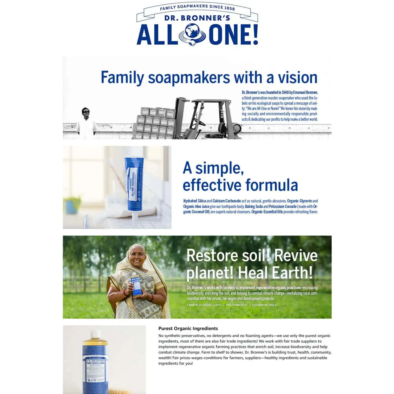
What they do well
- Although there is a lot of text, it makes the shopper want to read and learn because of the way the banners lead one after the other.
- Great story.
What can be improved
- Not much on the product, why it’s better.
- Could show a disconnect in the message because it is for toothpaste, but shows soap.
14. Gerber Mealtime
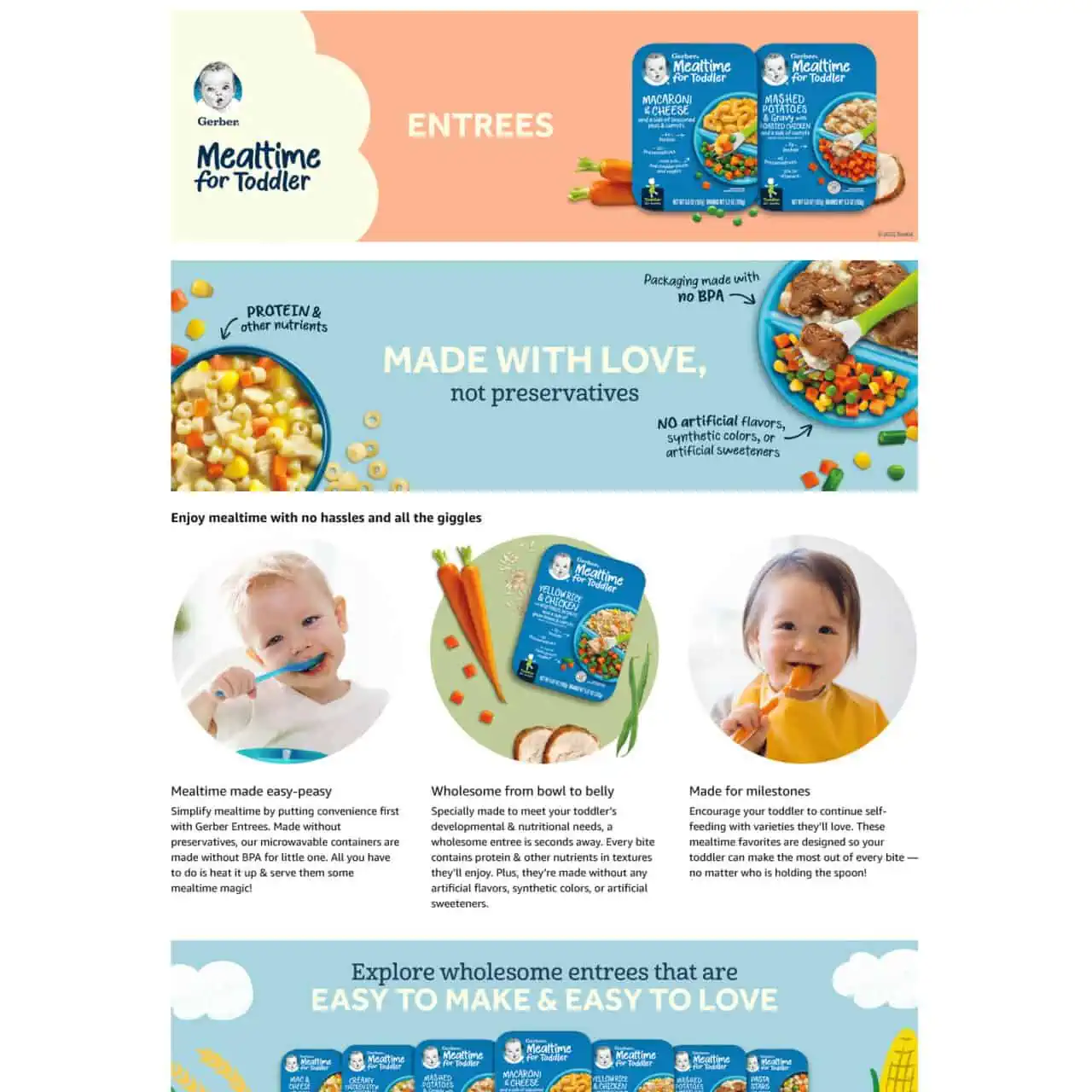
What they do well
- Wonderful color scheme and use of shapes.
- Harsh rectangles corners are softened with colors, closeup images and cute baby faces.
- Leads the shopper through the images and what to look at with arrows.
What can be improved
- Not much. Love it.
15. Drill Brush Power Scrubber
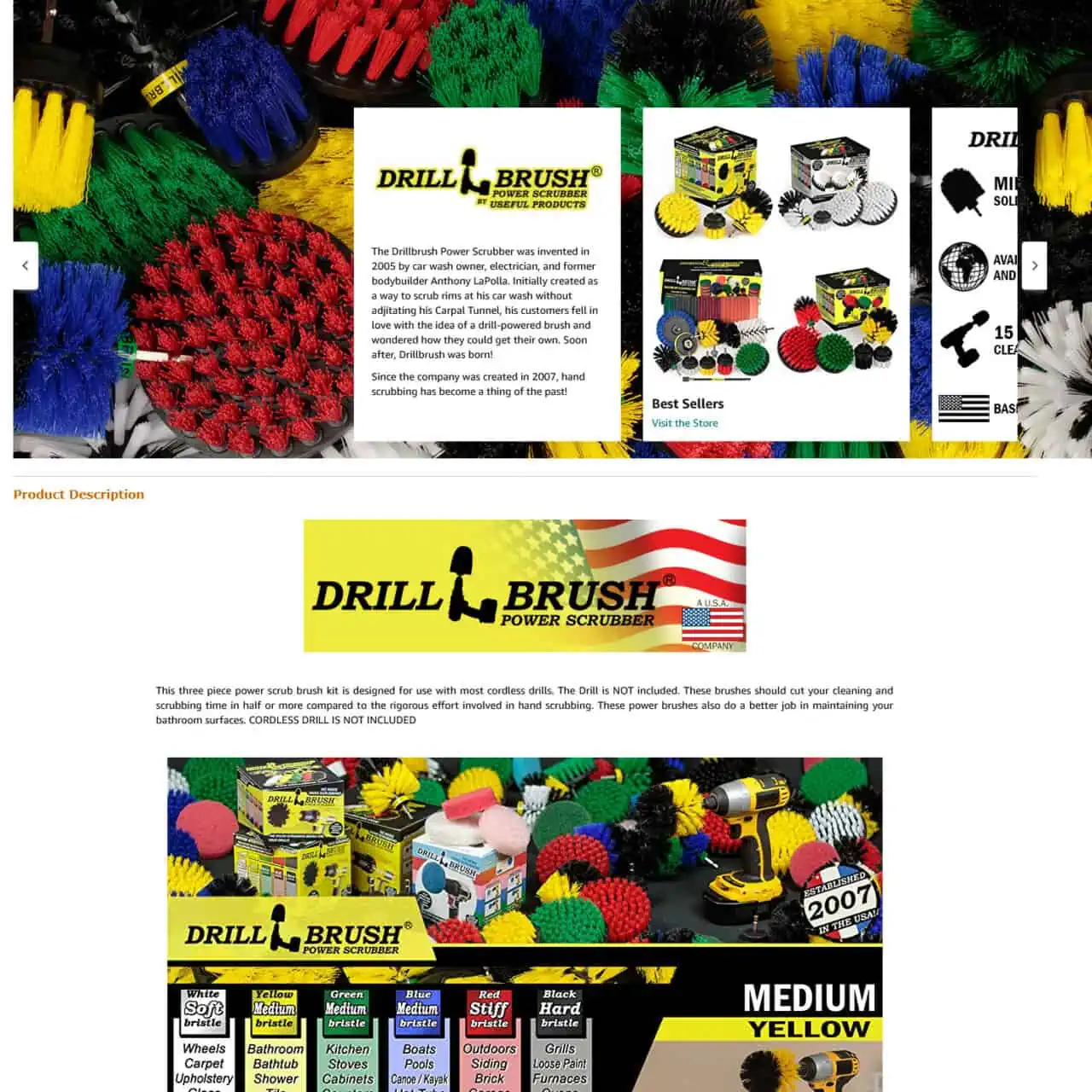
What they do well
- Bold colors.
- Consistent with their product and packaging.
What can be improved
- Mostly focused on benefits and what the product is.
- Not enough on the benefits, the before vs after.
16. Scotch Magic Tape
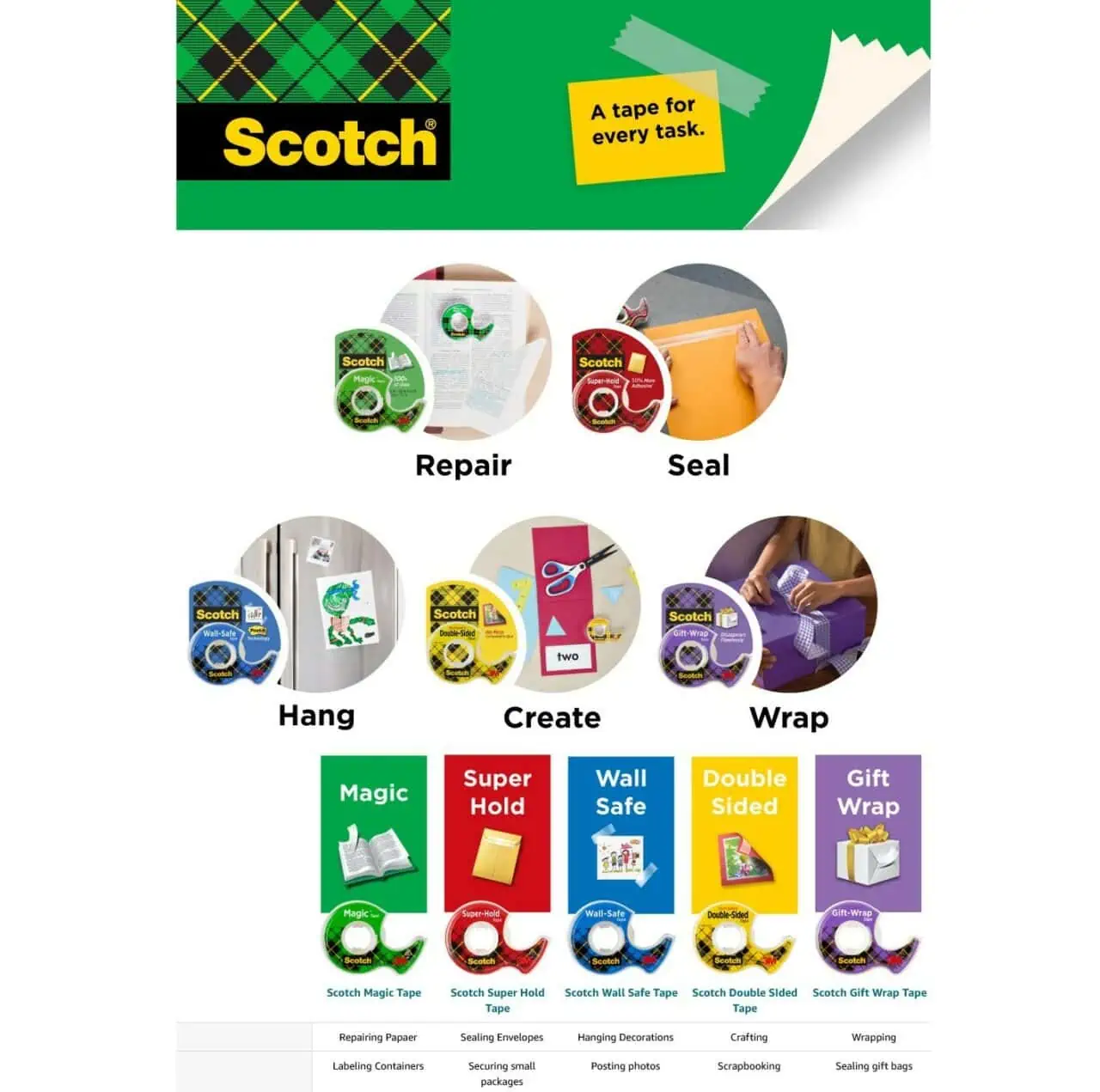
What they do well
- Uses color to coordinate their products.
- One word benefits.
- The entire content looks like a post it which is part of their family.
What can be improved
- Not much.
17. Takeya Deluxe Coffee Maker
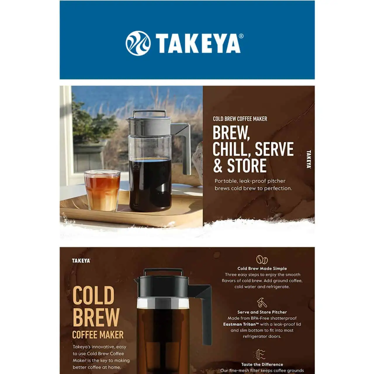
What they do well
- Two main colors bring consistency and harmony.
- One lifestyle image showing the final benefit.
- One 3D product image showing why it’s better than the rest.
What can be improved
- This one nails it.
18. Miyoo Mini
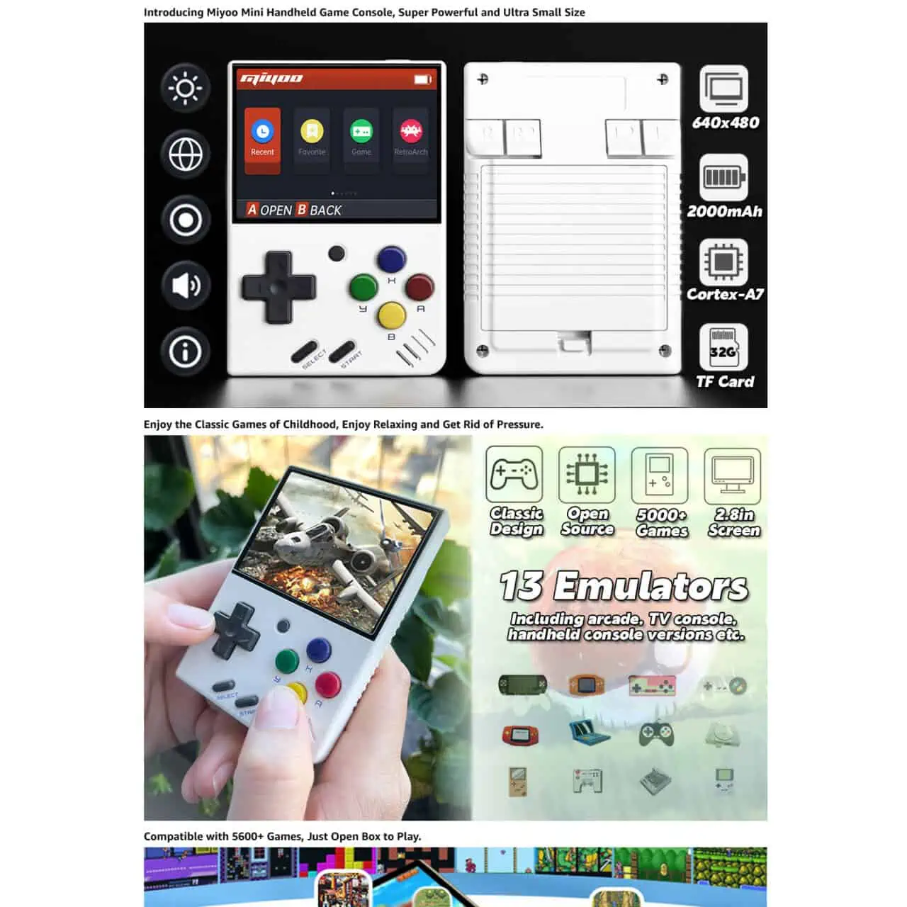
What they do well
- Makes you want to buy the product to play games.
- Shows a lot of promise.
- Good in use image.
What can be improved
- Too focused on features. Tell me how many hours the battery will last, not 2000mah.
- Icons randomly in the image that no one knows what it means.
19. Logitech K480
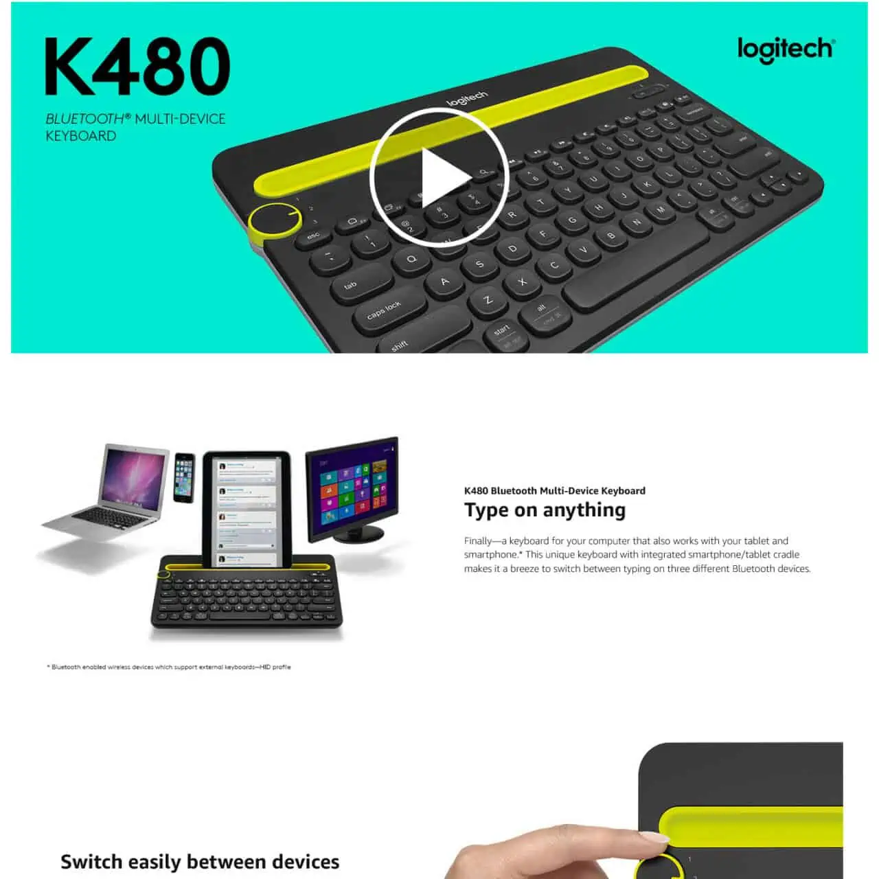
What they do well
- Bold video to lead the shopper.
- Wonderful simple design.
- Big crisp images.
What can be improved
- Not much.
20. SHW Standing Desk
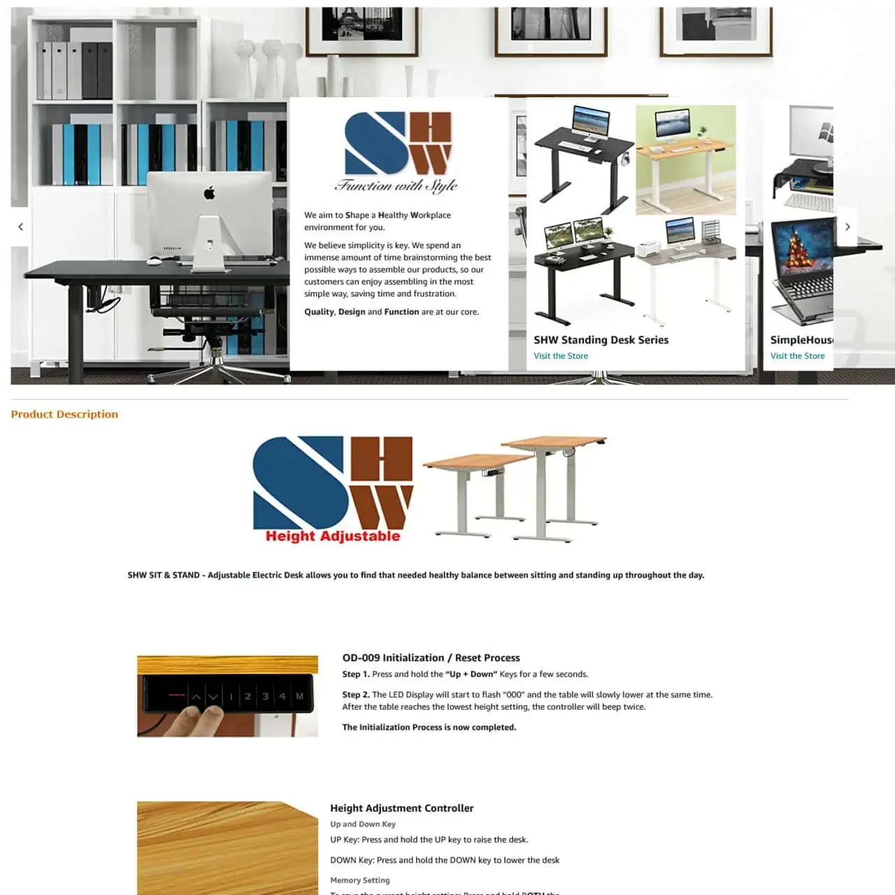
What they do well
- Shows the different variety of products they also offer.
- Shows how to adjust which is something many people want to know.
- Answers a lot of FAQs directly.
What can be improved
- Doesn’t sell the benefits enough. Why this over the other standing desks? Is it quieter? Faster? More solid? Better electronics? Can it support 2 gorillas?
21. Exerpeutic Folding Exercise Bike
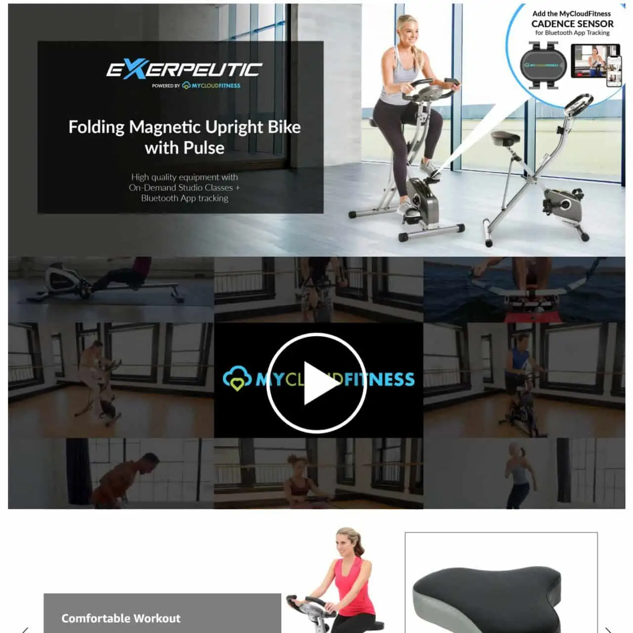
What they do well
- Shows the benefit banner first to gain attention.
- Includes video with lots of lifestyle action.
What can be improved
- Lots of information towards the end which is overwhelming. Starting showing their app and tablet which takes the focus away from the bike.
22. Fisher Space Pen
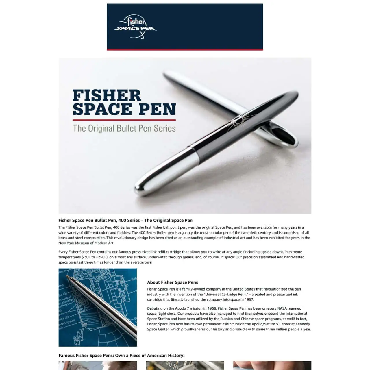
What they do well
- Beautiful image of the product. Makes you want one.
- The image of it being used by astronaut needs to be be up higher.
What can be improved
- About us isn’t needed at the top.
- Convert the text into images and banners to visually convey the story.
23. Toshiba Microwave
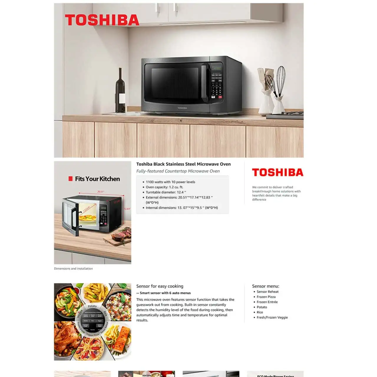
What they do well
- Hits every point a consumer wants to know. How it looks in a space, dimensions, what you can cook and so on.
- Images are clear and on point.
- Text is in bullet points.
What can be improved
- Even with lots of detail and text, Toshiba does it all very well without being overwhelming.
24. Ring Video Doorbell
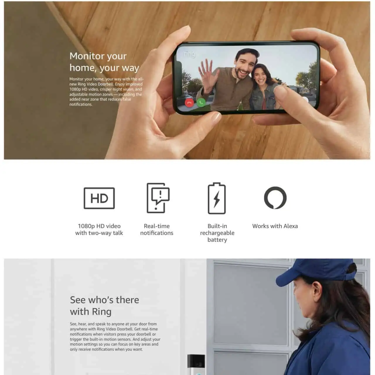
What they do well
- Hyper focused on their benefit – “Seeing who’s there”.
- Clean and simple.
- No confusing messaging.
What can be improved
- Nothing.
25. Amazon Fire Tablet 7

What they do well
- In use images.
- Large headers showing benefits.
What can be improved
- The beginning of their content can be more engaging and impactful.
- Starts slow and too basic.
26. Elgato Stream Deck
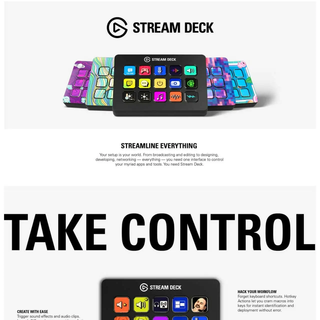
What they do well
- Although I don’t know what it is, the visuals get me interested.
- Accent colors in the icons really make it pop.
- Big attention grabbing heading.
What can be improved
- “Take control” means nothing. Wasted opportunity.
- Very confusing what it is unless the person already knows about it.
27. Razer Kishi (iPhone)
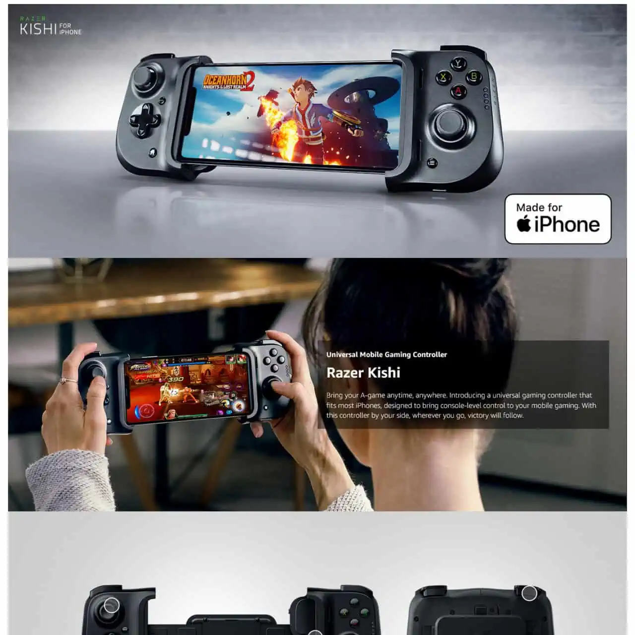
What they do well
- Amazing first image of what the final product and benefit is.
- 2nd image shows it being used and what it would look like in real life.
- What you get and what the exact product is. Very clear.
What can be improved
- Nothing.
28. Greenworks Corded Lawn Mower
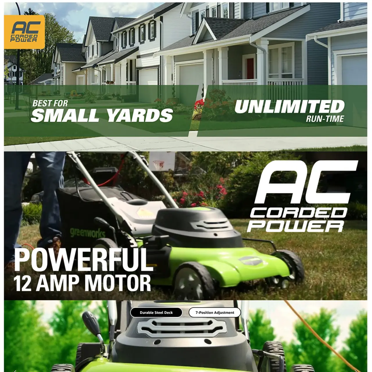
What they do well
- “Unlimited” word is a great trigger word for their benefits.
- Shows exactly who it’s for.
What can be improved
- Doesn’t answer why I should buy a corded lawnmower over a small gas or electic.
29. Dyson Cyclone 10
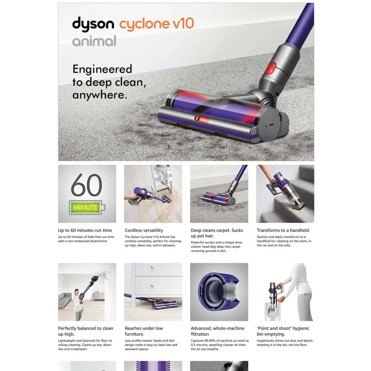
What they do well
- Consistent design and colors.
- Detailed images and mix of 3D and real life to make it very high def.
- Showcases all their benefits and features.
What can be improved
- Using larger banner styles could be much more engaging and focused.
- Can cut out some images because it’s not as relevant or high priority to the shopper.
30. ZHWS Countertop Organizer
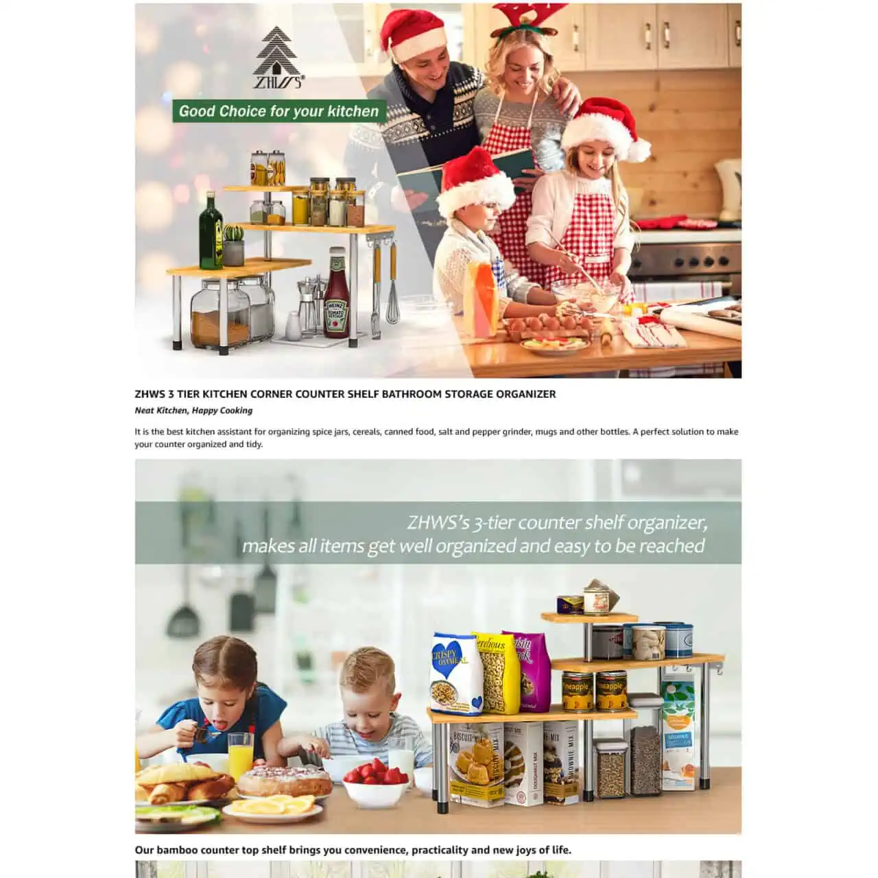
What they do well
- Shows what it looks like after.
- Different lifestyle images.
What can be improved
- Why Christmas image for 11 months of the year?
- Photoshopped image feel.
- Bad grammar.
31. Luxe Bidet Neo 120
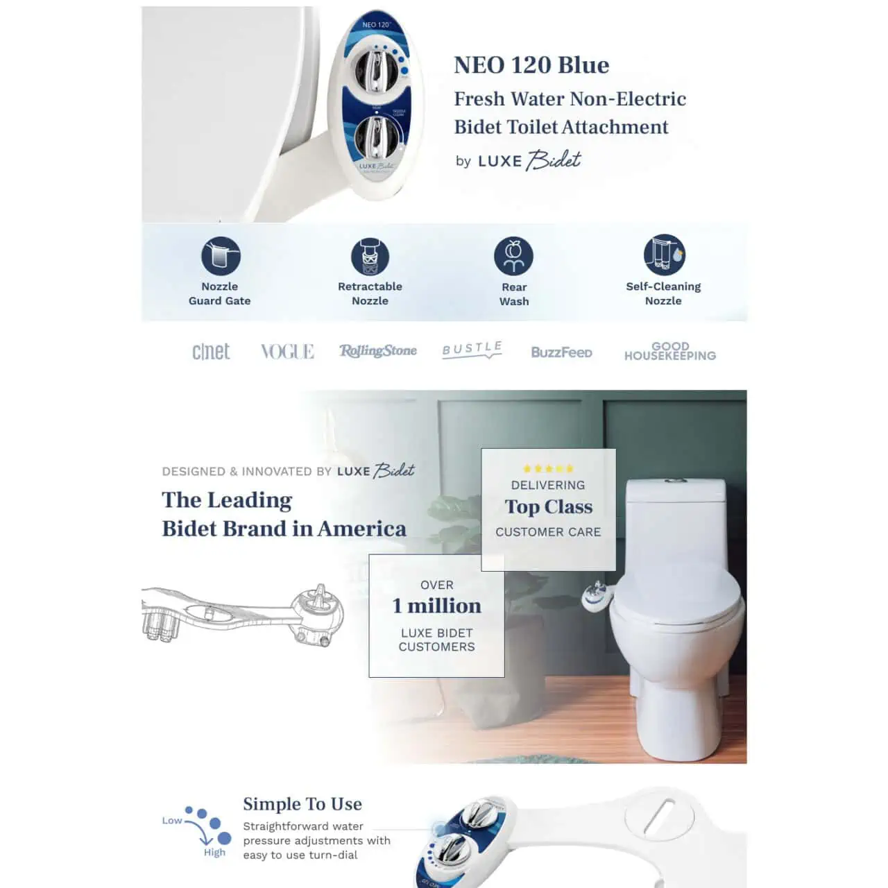
What they do well
- Clean white design gives clean feeling which is what it should do.
- Makes the product look and feel high end.
- Trust symbols and wording like selling “1 million”.
- Lots of instructions and visuals to deliver trust.
What can be improved
- Nothing much.
32. Mixology & Craft
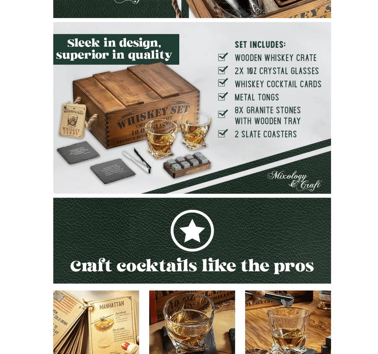
What they do well
- Enhanced product listing with an inviting visual template.
- Makes the product look and feel premium.
What can be improved
- Nothing.
33. Omnit
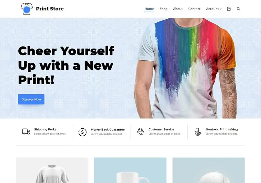
What they do well
- Cleanly and clearly highlights their benefits.
- Plenty of instructions and visuals to deliver trust.
- Makes the product look and feel high end.
What can be improved
- Nothing much.
34. Wyze Cam
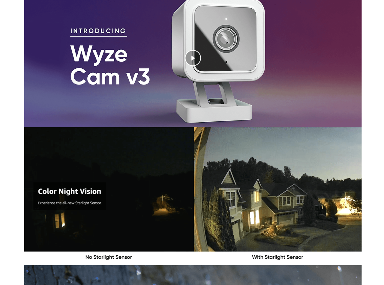
What they do well
- Detailed images and mix of 3D and real life to make it very high def.
- Shows precisely who it’s for.
- Makes the product look and feel high end.
What can be improved
- Colors could be improved to provide more ‘pop’.
35. Otter Box
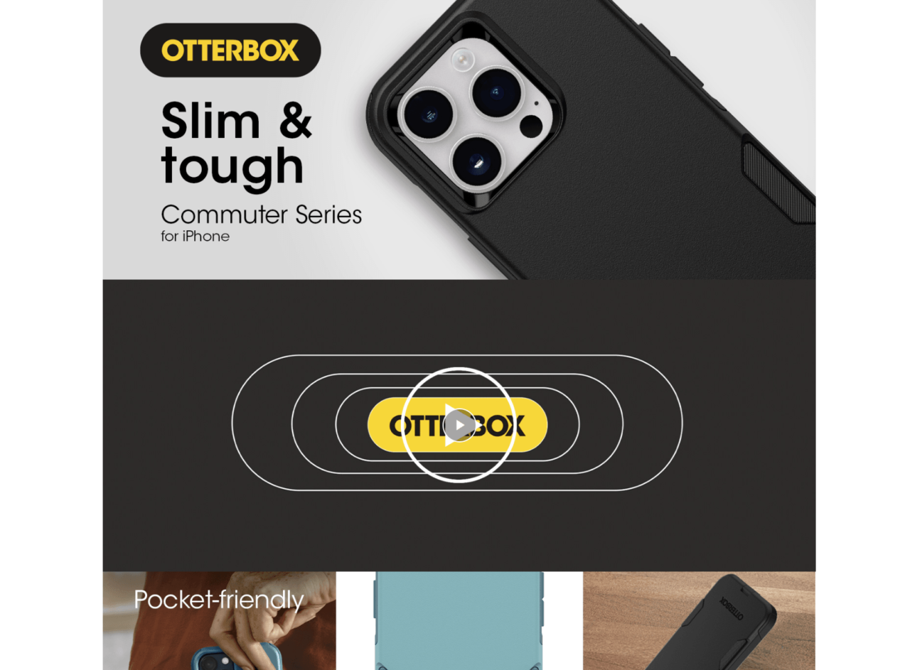
What they do well
- Shows exactly who it’s for.
- Awesome initial image of what the final product and benefit is.
- Makes the product look and feel high end.
What can be improved
- Nothing much.
36. Quantum Fuel Systems
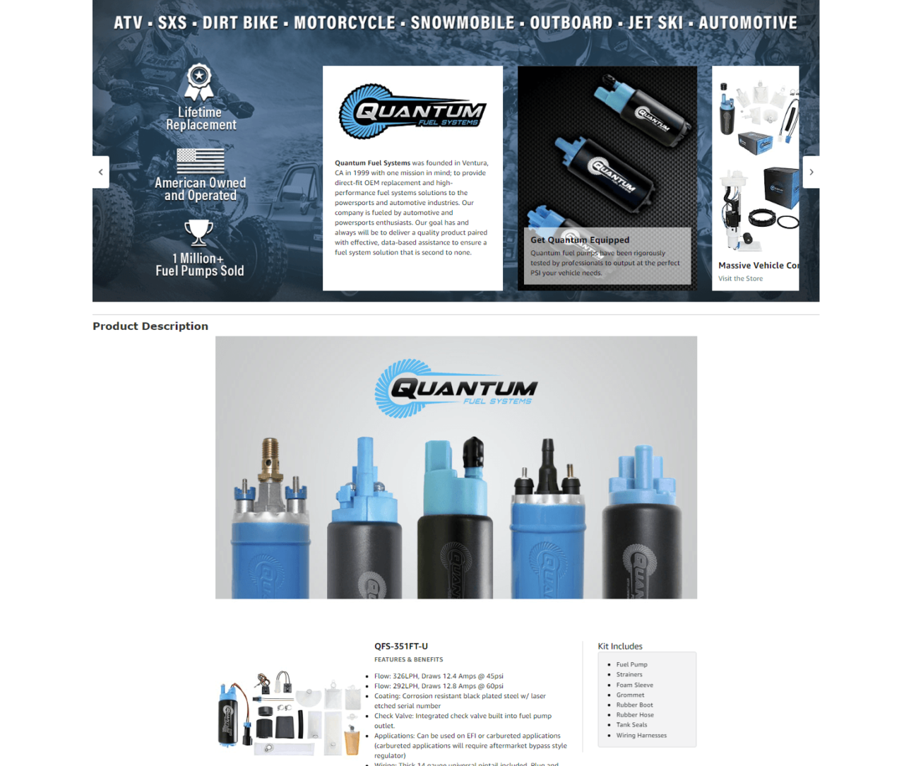
What can be improved
- Detailed images and mix of 3D and real life to make it very premium.
- In use photos and high quality shots deliver.
What they do well
- Plenty of information towards the end which can be overwhelming.
37. Cambio Roasters
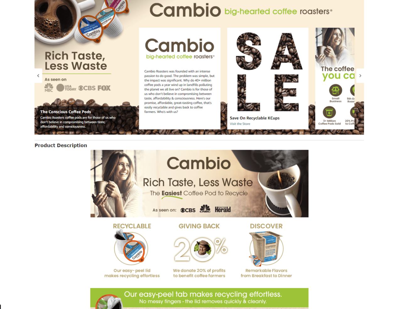
What they do well
- Very vibrant and good use of colors and font.
- Cleanly and clearly highlights their benefits.
- Makes the product look and feel premium.
What can be improved
- Including a video could help embody their product in a more prominent manner.
38. Le Creuset Cerise
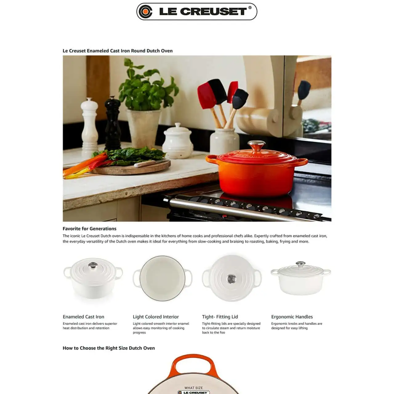
What they do well
- Trust photo shot that really sells the product.
- Although it’s a big brand, they emphasize why you should get their instead of others.
- In use photos and high quality shots deliver.
What can be improved
- Could use more brand colors to make it pop rather than white.
Why is Amazon A+ content so important?
Below are some of the benefits of A+ content on Amazon:
Increased sales and conversions
Creating Amazon A+ content in your product listing shows that your brand is trustworthy and reliable.
Shoppers don’t know or care who you are; they only care about one thing. What’s in it for them. Does the product match my needs? The examples above show how it creates more trust and reliability.
Creates trust and reliability
Creating A+ content in your product listing shows that your brand is trustworthy and reliable. Shoppers don’t know or care who you are.
They only care about one thing. What’s in it for them. Does the product match my needs? The examples above show how it creates more trust and reliability.
Stay ahead of your competition
The Amazon marketplace is highly competitive and great A+ content on your listing will differentiate you from those that don’t have one.
Eligibility criteria
To be eligible to create A+ content, you must satisfy the following requirements:
- Your brand must be registered and have an image-based trademark and active text. The trademark should also appear on your packaging or products.
- The owner of the trademark should submit the Amazon brand registry application.
- Enroll your brand.
Once Amazon approves all your information, you can then start to create product descriptions using A+ content for your brand. Make sure the brand name matches the name provided in the brand registry.
Summary of Tips to Improve Your Amazon A+ Content
1. Visually show the core selling points of the product
When creating your A+ content, you must visually show your products’ core selling points. Remember, shoppers, respond more quickly and show commitment to purchase products when brands take steps to highlight what makes their products special and unique.
2. Communicate quickly and effectively
Shoppers respond better to a simple product listing that communicates value propositions. Therefore, be selective in the information that goes into your A+ content.
3. Differentiate your product from your competitors
Make your product stand out. Every product listed on Amazon is a potential competitor to hundreds of other products. One of the best ways to ensure that buyers don’t leave your product listing for another is to showcase the key differentiators of your products.
You can do this by first knowing who your competitors are and then capitalize on the product differences (remember, it’s against Amazon policy to mention other sellers or products in your Amazon A+ content).
4. Address customer’s frequently asked questions
Research potential questions that shoppers may ask and take steps to provide result-based answers. This will help you address whatever is bothering them upfront.
For example, if you sell health supplements, potential areas to address include ingredients location, certifications, how to use the product, and side effects.
5. Optimize for mobile
Lastly, take steps to optimize your Amazon A+ content for mobile. In today’s internet age, shoppers turn to their smartphones to make purchases online.
Therefore, you must make your Amazon A+ content compatible for desktop and mobile.
6. Establish Credibility and Trust
Go beyond just listing features. Instead, showcase how your product benefits the customer’s life. Use clear, concise language and address their pain points.
Don’t make exaggerated claims. Be upfront about any limitations and focus on the genuine value your product offers.
Frequently asked questions about Amazon A+ Content
How much does A+ content cost?
Amazon A+ content is available free of charge for vendors and sellers. However, Amazon charges vendors for Premium A+ content, an invite-only program that comes at a price.
Amazon “Manage Your Experiments” feature was introduced to help sellers test the performance of their Amazon A+ content. This feature will help you better understand what images or texts work best for your target audience. The Manage Your Experiments feature works like this: you will create two different versions of A+ content, activate them, and keep track of the content to know which one works best for your audience.
Is Amazon A+ content worth it?
If you have ever wondered whether or not A+ content is worth your time and energy, creating an Amazon A+ content page should clear your doubt.
According to Amazon, this feature has helped millions of sellers and vendors to increase sales and conversion rates.
Can I preview A+ content?
Of course, you can previous your A+ content. As you continue to add content to your A+ content page, you can click the “Preview” button to see what your content looks like at any time. The preview comes in both mobile and desktop versions.
What is meant by EBC in Amazon?
Amazon EBC is the acronym for Enhanced Brand Content. It is now renamed to A+ Content. It’s a feature that helps sellers create an appealing product description for higher traffic and conversion rate.
What does Amazon A+ content do?
A+ content is an Amazon tool that sellers can rely on to best describe their products or inventory. In other words, A+ content lets brand owners easily add product descriptions, high-quality images and videos, charts, and brand stories.
At its core, A+ content can help you increase sales, traffic, and conversion rate.
How do I get A+ content in KDP?
Generally, you can get A+ content in KDP under the “From the Publisher ” section. However, the exact location varies and you need to scroll down a bit to view the content.
Also, from the KDP marketing page, you can create A+ content. From there to the A+ content manager to layout the content and submit it for review.
Is Amazon A+ Content on Amazon Indexed?
No, it is not indexed by Amazon.
What Are The A+ Content Image Sizes?
Logo Image: 600 x 180
Image Header w/ Text: 970 x 600 (Recommended)
Standard Image & Light/Dark Text Overlay: 970 x 300
Standard Single Right Image: 300 x 300
Standard Single Left Image: 300 x 300
Standard 3 Images w/ Text: 300 x 300
Comments
One response to “38 Amazon A+ Content that Converts”
-
Do you recommend someone who can create this for a new author, launching a kids book?
Related Posts

Shopify PPC Success: Powerful Tips to 10X Your Sales with Pay-Per-Click Advertising
In today’s hyper-competitive e-commerce landscape, mastering Shopify PPC (Pay-Per-Click) advertising…

Selling Cosmetics on Amazon: A Golden Ticket to Beauty Success
The approval process for selling cosmetics on Amazon can feel…

Don’t Miss Out: The Critical Role of Ecommerce Analytics Tools
In today’s digital marketplace, the difference between thriving and merely…


Leave a Reply