Article Summary (TL;DR)
✅ Learn to create your Amazon sales tracking tool within Google Sheets effortlessly.
✅ Utilize Gorilla ROI’s addon to automatically import Amazon sales data by SKU or ASIN, saving time and effort.
✅ Organize your spreadsheet into data, logic, and presentation sections for clarity and efficiency, ensuring easy navigation and understanding.
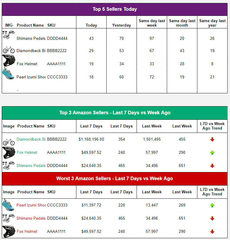
By the end of this article, you’ll know how to
- create your own Amazon sales tracking tool
- pull Amazon sales data by SKU or ASIN
- track sales by day, week, month or any other period you need
- feed and automate your sales dashboard
- copy a free Amazon sales tracker spreadsheet to your account
all within Google Sheets. You’ll look like a genius in front of your team.
Use the Gorilla ROI sheets addon to start automating your processes.
The basics to creating an effective Amazon sales tracker
In order to track sales data, you need – sales data.
If you are doing it manually, save yourself the headache and hassle of manually downloading reports by automating the work.
The reason why trackers and spreadsheets you first built enthusiastically ultimately fizzle out, is because the work required to update with data is a major hurdle.
As your product portfolio grows, your spreadsheets and various trackers grow with it. What also grows is the time it takes to update. It grows exponentially.
I bet you can find a wasteland of old excel or spreadsheets that you haven’t opened in years in your folders or drives.
In order to scale, where you can grow without increasing your workload to get data, we recommend using Gorilla ROI.
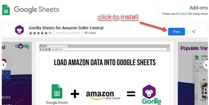
To get the Amazon sales data you need, use our free Gorilla Sheets addon which is free for any 3 SKUs.
Enter your SKU, not your ASIN.
The methods described in this article assumes you have:
- already installed the Gorilla Sheets addon
- connected to your Amazon seller account
- data has fully loaded (1-24 hours depending on your size)
Now, let the fun begin.
Laying the foundation
Whether you do this with manual data or with auto-updating data, structure your spreadsheets so that each tab is dedicated for a single purpose of data, logic, or presentation.
- Data
- Logic
- Presentation
Organizing “Data”
The sheet that keeps track of your data is compiled and stored in one place. Not all over the place in 10 different tabs.
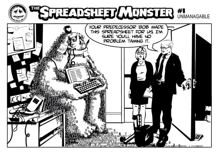
How often have you had to search every sheet and cell and update it with the newest data point?
If you keep all your data together in one big place, you can use this central location as the “database” of your spreadsheet.
This way, if you update the data in this single location, all your other sheets will be updated automatically.
Organizing “Logic”
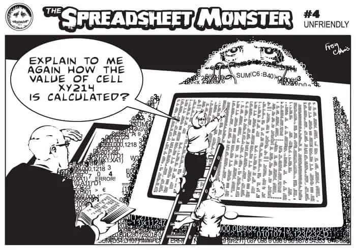
Likewise, don’t mix the data with the logic (formulas) on the same sheet, otherwise, it becomes extremely messy to separate.
Make it so that one sheet has all the data, and another has all the formulas and logic so that the sheet with the formulas do not have to be updated again. Make it so that the tab with the formulas will be 100% hands-off. It just updates automatically based on what the data sheet says as you update it with Amazon sales.
Organizing “Presentation”
Presentation is self-explanatory and there is a section of Do’s and Don’ts in the upcoming section.
Use the presentation sheet to create charts, tables, graphs and so on. It does not need any data or formulas. It uses the output from the formulas.
Again, the three basic and best practices to make your spreadsheet life simple.
1. Data sheets - stores data only
2. Logic sheets - only contains formulas and gets its data from the "Data Sheet"
3. Presentation - uses the output from the logic sheet to create charts, tables and visual presentation
Understanding how to build sales spreadsheets better
If you aren’t sure of what I mean so far, think of it like your house.
You have the following rooms:
- bedroom = sleeping, relaxing
- kitchen = cooking
- dining room = eating
- TV room = watch TV
- and so on
Organize your spreadsheet like a house.
What everyone does with sales spreadsheets is to create one where everything is everywhere and all mixed up.
The kitchen is used for cooking, sleeping, playing with pets, shaving your beard. The dining room is used as a swimming pool, toilet, project room, garage.
As you see, it is a mess. Your spreadsheets are likely the equivalent.
A home can have more than one room for each purpose like 5 bedrooms, 2 kitchens, 3 bathrooms.
In your spreadsheets:
- one tab could be for daily sales data
- one tab be for monthly sales data
- one tab be for return data
- one tab for product information data
- one tab to calculate the logic for monthly sales projections
- one tab to present projections
In this example, 4 are used for data.
1 is for logic. 1 is for presentation.
Let one tab serve one purpose (data, logic or presentation). This way, as your spreadsheet grows, it will not become a mess.
A real sales tracking spreadsheet example
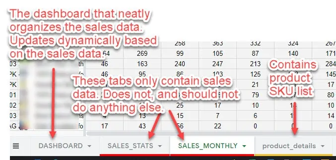
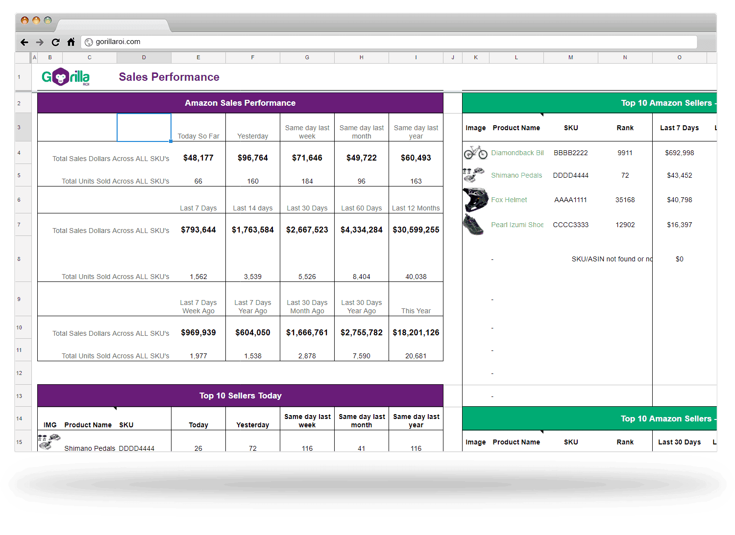
Here’s an example of a potential sales tracking spreadsheet for your Amazon sales. This is how we organize our sales tracker that you can save at the bottom of this article.
Dashboard = Presentation = Updated dynamically and what we look at. Updates based on sales data.
We use VLOOKUP, QUERY(), SPARKLINE() to create awesome looking dashboards for things like sales tracking, inventory monitoring, sales forecasting, cost analysis and more.
SALES_STATS = Data = the sales performance of each SKU over various time periods we track like
- Last 7 days
- Last month
- This month
- Last year
- Last week
We actually follow over 20 different sales periods to track how we are doing.
SALES_MONTHLY = Data = sales performance of each SKU by month.
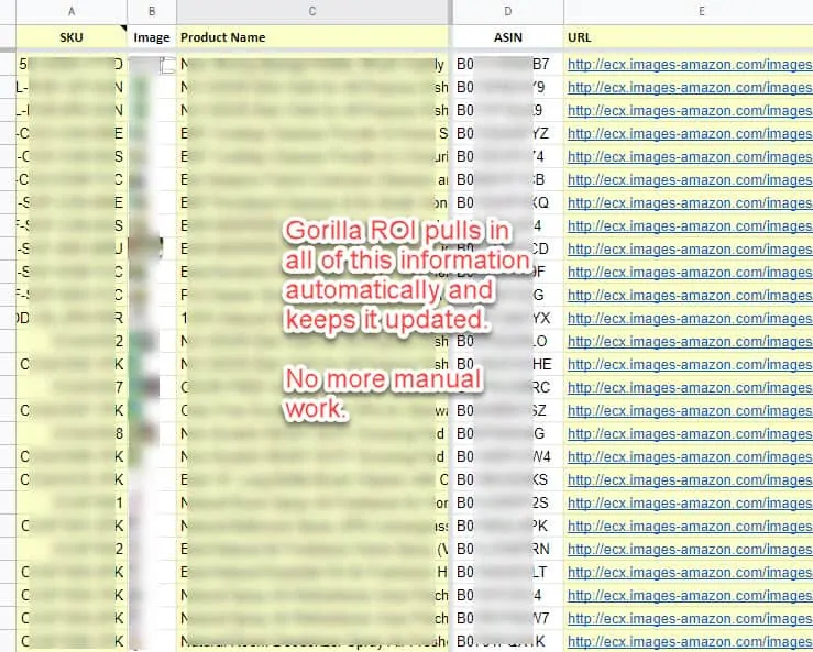
Product_details = Data = contains product information like the entire SKU list, ASIN, FNSKU, UPC etc. Get this using =GORILLA_PRODUCT().
If you have existing spreadsheets, try reorganizing it to separate the data and keep it clean before it gets even more out of hand.
Note: When creating a simple spreadsheet like this, a logic sheet is not required because Gorilla ROI handles data + logic.
Manual process to get daily sales into your sales sheet
There are multiple different ways of getting your Amazon sales data.
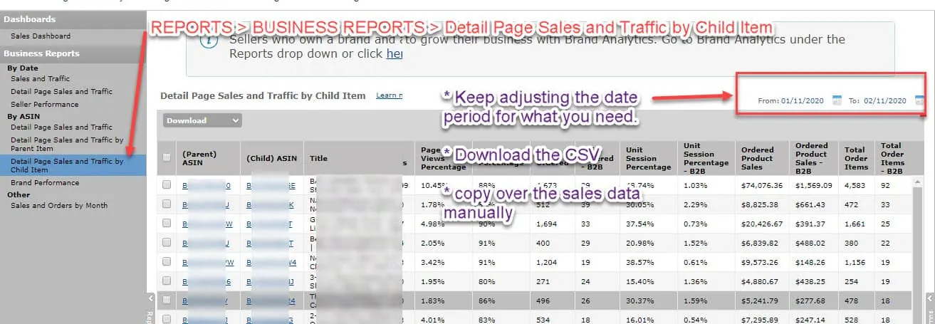
Here’s the manual (and painful) process.
- Go to seller central
- Go to reports > business reports > detail page sales and traffic by child item
- Change the dates on the calendar to what you need
- Export the data
- Open up the csv or excel spreadsheet and create a pivot table
- Extract the SKU and sales data
- Copy and paste to your main spreadsheet in the data tab
- Repeat each day (argh!)
It’s a painful and tedious process but it works. Keep doing it on a daily basis to track your Amazon sales.
But what if you want to track something other than daily sales? What then? I’ll get to that later.
Automatic method to get daily Amazon sales data
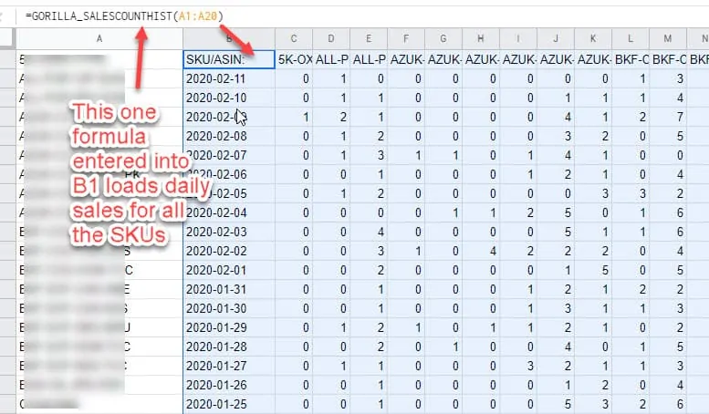
- Enter your list of SKUs in column A (let’s say you have 200 SKUs)
- In cell B1, you type in =GORILLA_SALESCOUNTHIST(A1:A200)
- Done
This formula will update itself every day and pull in the last 30 days of your daily sales for each of your 200 SKUs.
Get monthly sales into the spreadsheet tracker
Getting monthly sales numbers is the same process.
If you do it manually, you have to adjust your dates to the start and end of each month, export the data and then compile it again into a monthly column.
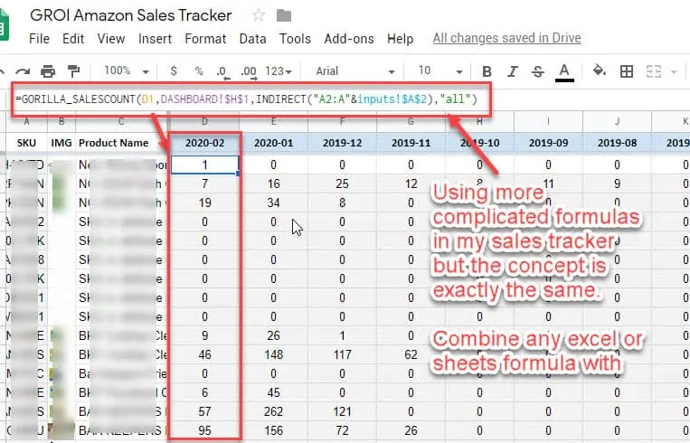
To do it automatically, use the formula =GORILLA_SALESCOUNT().
- Create a header row in the format YYYY-MM (don’t forget the dash)
- Use the formula =GORILLA_SALESCOUNT(D1, “US”, A2:A100, “ALL”)
- This will pull the monthly sales for the YYYY-MM that is entered into cell D1
- for the US market
- bulk load for SKUs in A2 to A100
- for all sales status
By making the sales formulas dynamic, anytime the inputs change, the sales stats change with it.
In this case, when the month ticks over and it becomes 2020-03 the headers are updated which the formulas will detected and then also start pulling data for 2020-03.
This way, the tracker is fully automated and all you have to do is focus on the numbers and making decisions of what to send and order.
Sales data presentation
If you have organized your data and logic, you can now turn your attention to the presentation.
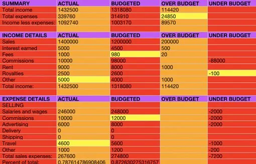
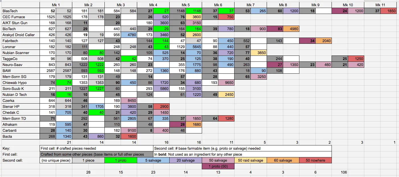
Here’s an example of an ugly presentation that everyone ends up creating.
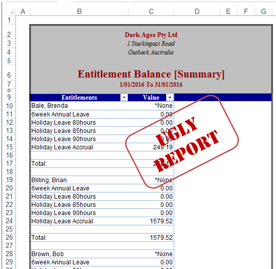
You get the point.
Coming back to the basics, this is because the data, logic, and presentation are combined into one place.
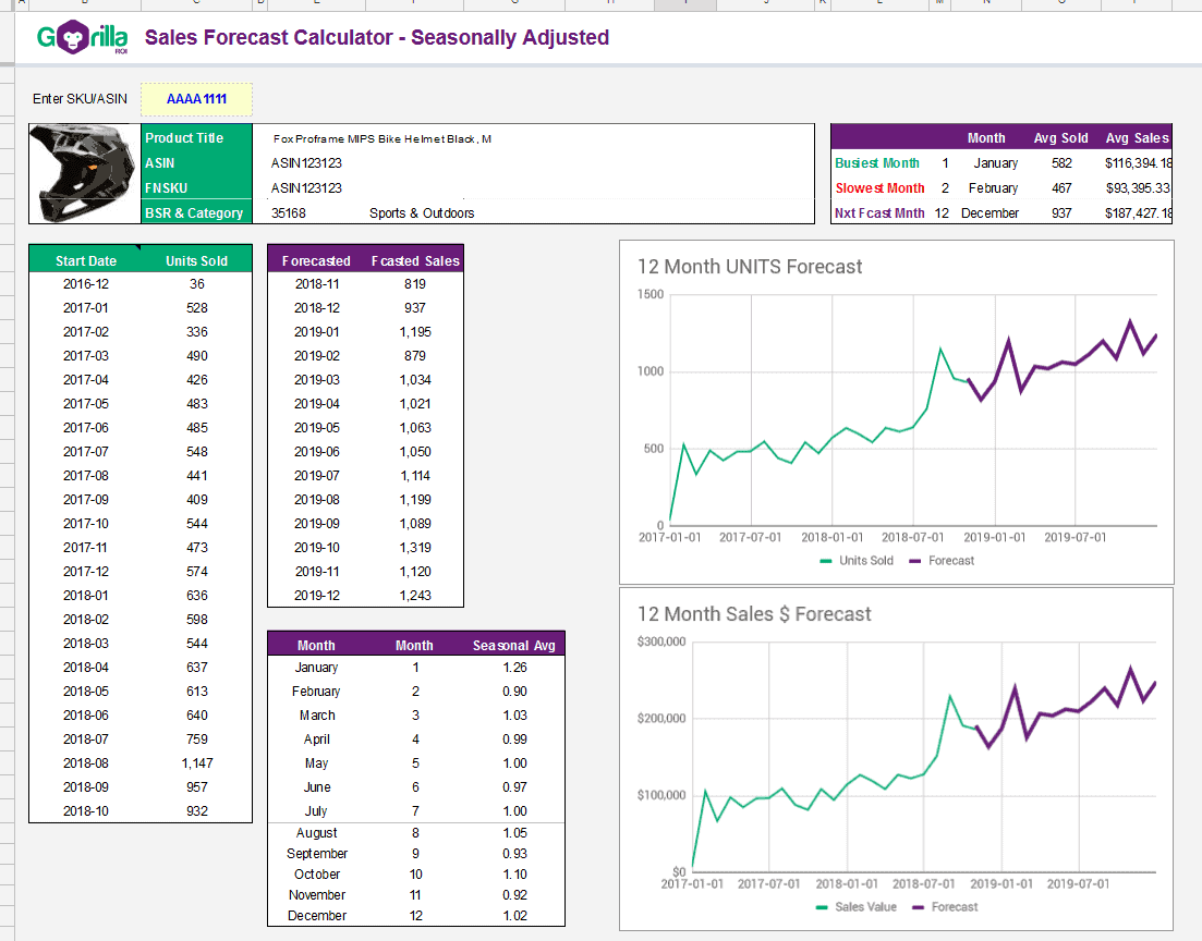
While design is subjective, here are some tips to make dashboards look like this:
12 Simple do’s and don’ts of spreadsheet presentation
- Don’t overuse different colors
- Do use 3-5 colors max. Keep the color palette consistent.
- Don’t color your cell unless there is a clear reason and it is so obvious everyone else will understanding the meaning.
- Do insert notes and comments in the cell to deliver the message.
- Don’t make the spreadsheet something only YOU can understand.
- Do understand the objective of what others need to see and future proof it.
- Don’t use the standard strong colors in the color bar
- Do use softer, neutral or pastel version of the colors
- Don’t overcrowd and stuff the sheet with as much data and numbers as possible
- Do focus on simplifying it and then simplifying it further. Display your core KPIs and the message you want to convey only.
- Don’t keep every column and row the same default size.
- Do expand and resize rows and columns to give added room and emphasis.
- Don’t use numbers to express everything.
- Do use icons and symbols to break up walls of numbers for visual understanding.
- Don’t be afraid to use grayish tones for text.
- Do emphasize the important data.
- Don’t put everything into a huge table.
- Do use multiple tables to break down the display into bite-sized tables.
- Don’t get too crazy by mixing multiple design elements to make it look “pretty”.
- Do keep the number of visual data presentation to max 2 per sheet. Stick to consistent use of bar charts or one other type.
- Don’t use pie charts. They are the worst.
- Do use bar charts or line charts instead. Please avoid pie charts… please?
- Don’t use 3D effects.
- Do use simple and clean 2D visuals.
Advanced techniques to boost your visual spreadsheet presentation
Keeping things as simple and to the point is the best.
To date, it’s hard to find a better way to visual data than a simple bar chart (horizontal and vertical) or a line chart.
With simplified tables and bar/line charts, you can blow people away with advanced sales dashboards because of the effectiveness and simplicity.
With just 3 advanced spreadsheet functions, you can turn your current spreadsheets from “meh” to “wow”.
VLOOKUP()
Sample Usage
VLOOKUP("ASIN B088325DS", A2:B26, 2, FALSE)
Syntax
VLOOKUP(search_key, range, index, [is_sorted])
If you structure your spreadsheets as I recommend into
- sales
- logic
- presentation,
you need a way to find the data without doing things manually.
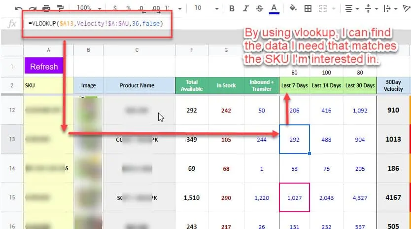
Use vlookup to find information for a particular ASIN like my inventory template.
VLOOKUP searches for the SKU, in the data sheet that has all the data, and pulls in the matching values for “last 7 days”.
This type of table is what I call the “logic”. There is no data. It pulls and updates based on the formulas.
It’s also not the “presentation” as this table is all I need to know my inventory status. It’s a logic sheet that is good enough to be the presentation.
Use VLOOKUP everywhere you can to eliminate manual data entry.
SPARKLINE()
Sample Usage
SPARKLINE(A1:F1)

SPARKLINE(A2:E2,{"charttype","bar";"max",40})

SPARKLINE(A2:E2,A4:B5)

SPARKLINE(A1:A5, {"charttype","column"; "axis", true; "axiscolor", "red"})
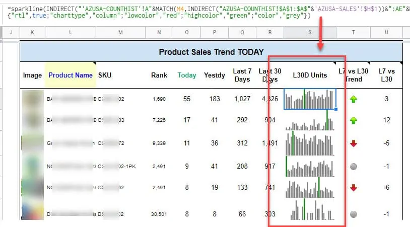
As they say, a picture is worth a thousand words.
What type of sales data is easier to read and understand?
This table?
Or this?
By using sparkline charts, you can create mini charts that fit inside a cell.
In my example, I’ve combined sparkline charts for each sku/ASIN inside a simplified table.
Nothing fancy. Just clean, simple and straight to the point.
QUERY()
This is one of the most powerful advanced functions that Microsoft Excel does not have.
This functions lets you truly use your spreadsheet like a database + application.
Sample Usage
QUERY(A2:E6,"select avg(A) pivot B")

QUERY(A2:E6,F2,FALSE)
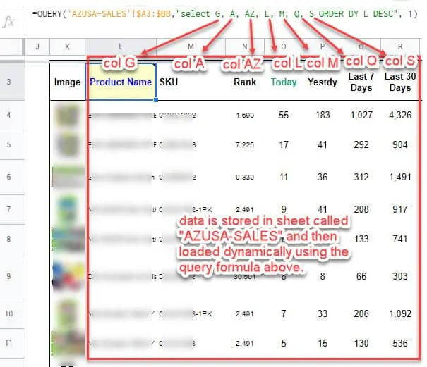
This is how we use it for our sales spreadsheet dashboard.
QUERY is used mostly for the “presentation” stage. It finds the data, and then dumps it onto the screen.
=QUERY('AZUSA-SALES'!$A3:$BB,"select G, A, AZ, L, M, Q, S ORDER BY L DESC", 1)
My query formula is getting the data from columns G,A,AZ,L,M,Q and S from the tab “AZUSA-SALES”.
It then tells the query formula to sort it in descending order based on the data in column L of the AZUSA-SALES table.
The result is what you see in the screenshot above.
Why is this so awesome?
If you have a big sheet of seemingly random and messy data, you can ask QUERY to do all the hard work to find, sort and display the data for you.
You could create multiple tables based on your needs.
- A table analyzing conversion rates
- A table tracking sales (as shown above)
- A table tracking the child products of a particular parent
- A table tracking the BSK rank
- and so on
Free Amazon Sales Tracker with Google Sheets
The template can be copied with your Google account.
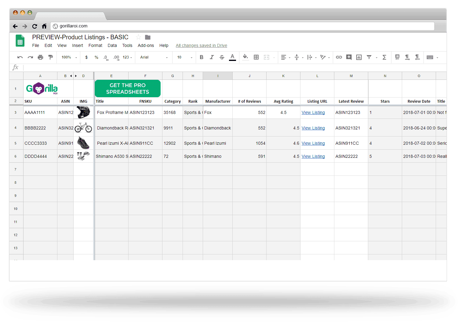 If you are looking for a way to supercharge your existing spreadsheets to eliminate the manual data work, or build 100% flexible internal tools, check out Gorilla ROI.
More tutorials
- Bulk load and convert SKU to ASIN and vice versa
- Get inventory data
- Get sales data
Comments
Related Posts

10 Profitable Product Categories for Amazon Affiliates 2025
What you’ll learn Amazon is a favorite for experienced and…

Unlock the Secret to a Profitable Automated Amazon Store: How to Build a Hands-Free Income Stream
Ever dreamed of running a profitable Amazon business while sipping…

Master Amazon New Restricted Keywords: A Seller’s Guide to Success
Changes to Amazon’s restricted keywords list have taken a lot…










Leave a Reply